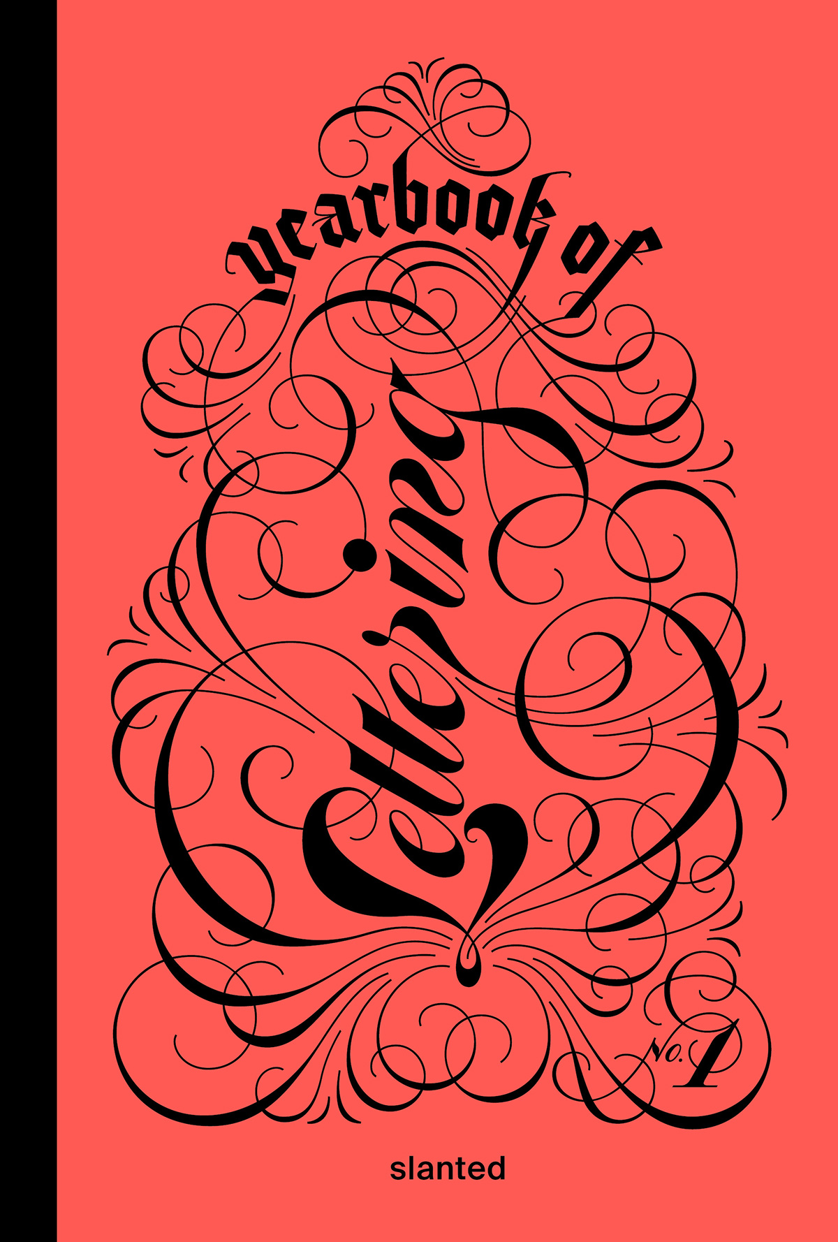
The Yearbook of Lettering presents a selection of lettering artwork created all over the world—from traditional calligraphy and hand lettering to street art and graffiti, showcasing the manignific and bright range of different styles.
Letters and typefaces not only transport information but also create a feeling and have a personality. Lettering takes this a step further—with its movement, artistic strokes, and variety, it has the potential to radiate a whole range of energies and tell stories of harmony and distortion, about positive and negative space. Words become drawings and pictures themselves.
Born out of the success of the concept of the Yearbook of Type, we have created a new book series: the Yearbook of Lettering. It presents a selection of lettering artwork created all over the world—from traditional calligraphy and hand lettering, street art and graffiti, to 3D digital lettering, showcasing the vibrant and wide range of different styles and techniques.
Publisher & Editor: Slanted Publishers
Publishing Direction: Lars Harmsen, Julia Kahl
Art Direction & Managing Editor: Tessa Breuer
Assistance Graphic Design & Editing: Juliane Nöst
Cover Artwork: Yinglish Ying Chang (front), Xesta Hugo Moura (spine)
Release: Autumn 2024
Format (w × h): 16 × 24
Volume: 320 pages
Language: English
Workmanship: Stiff brochure with thread-stitching, full-color + spot color, hot-foil embossing
Papier: Peydur Neuleinen (Cover), Munken Print White 1.5 (inside)
ISBN: 978-3-948440-53-4
Price: € 42.–
“The book comes in a high-quality cover with foil embossing and is visually realized with graphic attention to detail. A lavish blurb recalls the love of typography and emphasizes: “The world of lettering, calligraphy, graffiti, and 3D-lettering unveils itself as challenging and sublime.” This motto runs through every page, giving the main protagonist – the hand-painted, folded, blown-up, digital or analog letters – the space they need to unfold their effect and leave an impression.”
– Grafikmagazin
“A mine of inspiration or simply a feast for the eyes of those who love letters and the words they express.”
– Amazon.com
“This comprehensive publication stands as a true testament to their commitment in providing artists with a global platform for typographic expressions.”
– The Inspiration Grid
“A platform for recognition …”
– Selection Blog
“This book is so inspiring, and I highly recommend you to get one if you are interested in Calligraphy and Lettering.”
– Stella Wong
“What a great collection to browse through, I already got super motivated to try out new things again and was so inspired by reading the ambassador interviews 😍”
– Sarah Rebtine
“Looking at all the amazing work in the new Yearbook of Lettering, I felt the urge to spend more time on my lettering and practice regularly. ”
– Vincent Wagner


 Yearbook of Lettering #1